When Printing Works Better Than Thread

Executive Summary
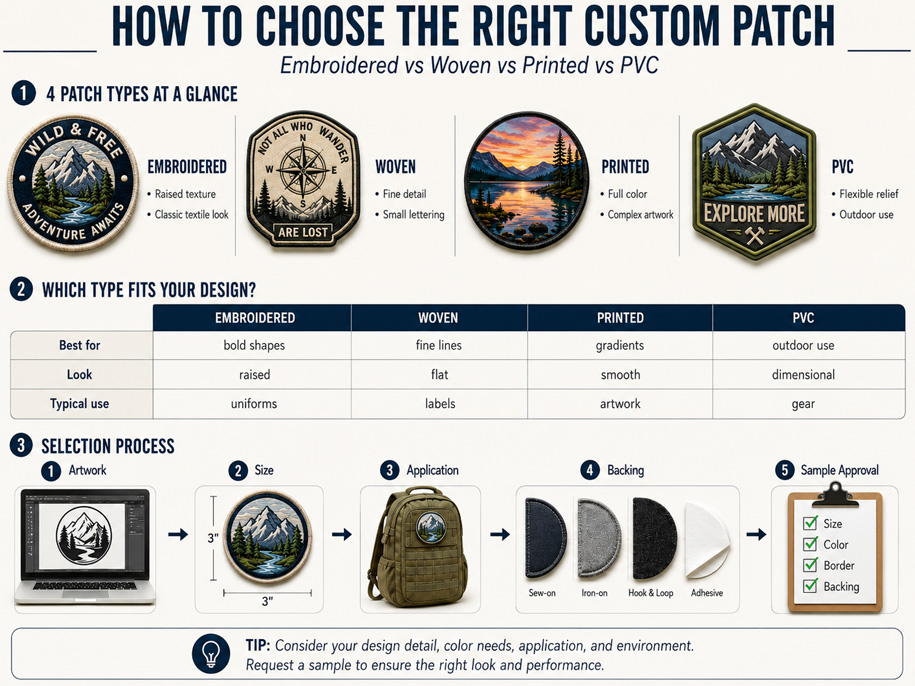
Thread gives a patch texture and physical depth. Printing serves a different purpose: reproducing color information that cannot be divided cleanly into stitched areas. Photographs, soft shadows, gradients and painted effects are often better candidates for print-based production.
For buyers considering full color custom patches, the question is whether the artwork depends on continuous color. If simplifying it into thread colors removes faces, lighting or atmosphere, printing may preserve the design more faithfully.
Successful production requires more than sending a JPEG to a factory. Resolution, final dimensions, color space, substrate and physical proofing all affect the result.
The Color Problem Thread Cannot Always Solve
Embroidery translates artwork into thread areas with defined colors and enough physical space for construction. This works well for bold logos and graphic emblems but becomes less suitable when a design depends on gradual color changes.
A portrait, misty landscape or smooth blue-to-violet transition can be approximated through selected threads, but the image must be interpreted. The result becomes more graphic and less photographic.
Printing treats the artwork as a continuous image, allowing color changes without assigning separate thread to every tone.

Artwork Characteristics That Favor Printing
The following characteristics indicate that print-based production deserves consideration:
- Photographic faces, animals, products or locations
- Smooth gradients without visible color steps
- Shadows, highlights and reflected light
- Watercolor, airbrush or painted textures
- Illustrations containing many closely related colors
- Fine surface patterns that would become heavy in thread
- Artwork whose identity depends on realistic tonal variation
A small gradient does not automatically require printing; it may be redesigned as flat colors. Printing becomes valuable when flattening color would fundamentally change the design.
| Artwork behavior | Thread-based interpretation | Printed interpretation |
| Flat brand colors | Strong graphic result | Clean but less tactile result |
| Smooth gradient | Converted into selected color steps | Preserved as a continuous transition |
| Portrait or photograph | Simplified into graphic shapes | Retains more tonal information |
| Painted texture | Recreated selectively | Better suited to visual texture |
| Directional shine | Thread can create physical light effects | Printed highlight remains part of the image |
| Brand heritage look | Raised thread may support the concept | Flat color surface may feel more contemporary |
The table describes visual tendencies, not guaranteed outcomes. The final result depends on the supplied artwork, printing method, patch surface and approved sample.

Full Color Does Not Mean Unlimited Reproduction
“Full color” does not mean every screen color transfers exactly. A monitor creates color with light, while physical production uses colorants on a material surface. Texture and surrounding colors also affect perception.
RGB and CMYK describe color differently. Adobe notes that mode conversion changes color values and that some RGB colors may fall outside a CMYK output space. Preserve the editable original while the supplier prepares its required output version; repeated conversion can complicate later correction.
A physical color proof for patches is more meaningful than an emailed image because it shows how material and process influence color. Critical brand colors need an agreed evaluation reference.
Resolution Must Be Judged at Final Size
Raster images are made from pixels. A file may look sharp online but reveal limited detail when enlarged. Evaluate the original pixel dimensions against the finished patch size.
Adobe distinguishes total pixel dimensions from print resolution, which describes how densely pixels are used at output size. Changing the resolution value without resampling adds no image information; resampling cannot recover detail that was never captured.
For high resolution patch artwork, supply the original photograph or design export-not a screenshot or social-media download. The manufacturer should confirm suitability at the actual output size.
Preparing Sublimation Patch Artwork
For efficient proofing, an artwork package should include:
- The highest-quality original raster image available
- An editable vector file for logos, text and boundary shapes
- A layered working file when color adjustment may be required
- The intended finished width and height
- A reference showing the required crop and orientation
- Identified brand colors where matching is important
- Notes distinguishing essential details from optional background content
Heavy sharpening can create edge halos, while aggressive compression introduces blocks and noise. Neither restores missing detail.
Keep text editable or supply it as vector outlines so names, dates and slogans can be evaluated separately from the photograph.

A Controlled Proofing Workflow
Green House recommends approving print-based patches through a documented sequence.
1. Confirm the production dimensions
Judge the design at its exact intended size, not only in an enlarged screen view.
2. Review the production crop
Confirm that faces, text and important objects remain inside the usable area.
3. Inspect tonal separation
Important features should not disappear into one dark or light region.
4. Compare the physical sample with the approved source
Use consistent lighting and describe corrections specifically-for example, “the blue shadow is too dark.”
5. Keep an approved production reference
Retain the approved sample, artwork version and written changes for bulk-order comparison.
When Thread Is Still the Better Answer
Do not select printing only because it displays more colors. For bold shapes and a tactile emblem, thread may communicate the identity more effectively through direction, sheen and relief.
Select printing when continuous tone carries the image; select thread when relief and textile character carry it. A hybrid approach can add embroidered accents to an image but requires sampling.
Frequently Asked Questions
Are full color custom patches suitable for photographs?
Yes, when the source contains sufficient detail at final size. Printed patches for photographs should be approved from a physical sample.
Can printing reproduce an exact monitor color?
Not automatically. Monitors, profiles, output conditions and materials affect appearance. Critical colors require an agreed reference and physical proof.
Can a low-resolution image be fixed by increasing its resolution setting?
No. Changing the resolution value or adding calculated pixels cannot restore information missing from the source.
Are gradient logo patches always printed?
Not always. A gradient can become several flat thread colors. Printing is preferable when the transition must remain continuous.
Conclusion
Printing works better than thread when the artwork depends on continuous color rather than constructed texture. Photographs, painted effects, subtle shading and complex tonal transitions are strong candidates for full color custom patches.
The process begins with the original high-quality file, continues through color and resolution review, and ends with approval of a physical sample. Green House evaluates the artwork at its final dimensions and helps buyers determine whether printing will preserve the visual information that matters most.

Inside a Custom Embroidered Patch: What Determines Quality?
Related Article