Embroidered or Woven? Choosing the Better Finish for Fine Detail

Executive Summary
Fine detail creates one of the most difficult decisions in custom patch production. A logo may contain small lettering, narrow gaps, thin outlines or compact symbols that look clear on a monitor but change when reproduced with physical thread. The question is not simply whether embroidery or weaving is “better.” It is which construction can preserve the design at the required size while still creating the surface character the brand wants.
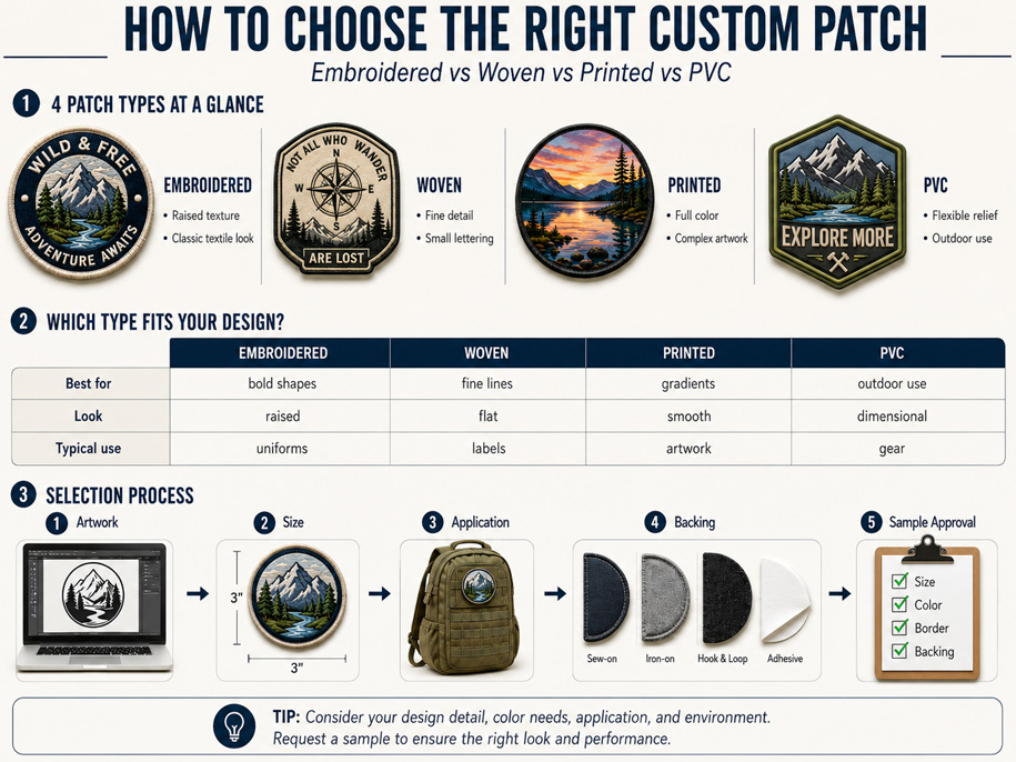
Embroidery places stitches on a fabric base and produces a raised, dimensional finish. Woven construction integrates the design into a flatter thread surface and can generally resolve finer lines and smaller lettering. For buyers searching for patches for fine detail, woven production is often the stronger technical starting point. Embroidery may still be preferred when texture, depth and a traditional badge appearance carry more importance than exact reproduction of every small element.
Why Screen Artwork Can Be Misleading
Vector artwork can be enlarged indefinitely on a screen. Thread cannot. Every letter, line and gap occupies physical space, so details that appear separate may compete when a logo is reduced.
Three problems commonly appear during reduction:
- Thin strokes become too weak to reproduce consistently.
- Small gaps close and separate shapes appear joined.
- Letter counters-the open areas inside characters such as A, B, D, O and R-lose definition.
The original file may be perfectly drawn and still be unsuitable at the requested size. This is a scale problem, so evaluation must use the final dimensions rather than an enlarged preview.
Two Different Ways of Building an Image
Custom embroidery places decorative stitches on a base fabric. The raised thread catches light and creates visible direction and relief.
A woven patch uses finer threads in a flatter surface. Narrow lines, closely spaced elements and small lettering can therefore be represented with greater visual precision.
The difference is resolution versus relief. Woven construction offers more resolution; embroidery provides more relief. The better result depends on what must remain recognizable at normal size.
| Design requirement | Embroidered finish | Woven finish |
| Bold symbols | Strong dimensional presence | Clean, flatter reproduction |
| Small lettering | May require enlargement or simplification | Usually retains finer character shapes |
| Narrow outlines | More likely to merge at small sizes | Better suited to fine line work |
| Tight negative space | May need additional spacing | Can preserve smaller openings |
| Surface character | Raised and tactile | Smooth and refined |
| Traditional badge look | Particularly strong | More label-like and contemporary |
This comparison is qualitative. Actual results depend on the artwork, dimensions, thread, color contrast and production setup. A physical sample remains the final reference.

Small Lettering Is a Design System, Not One Measurement
Buyers often ask for a universal minimum letter height. A single figure can be misleading because text legibility depends on more than height. Font weight, letter spacing, stroke width, capitalization and contrast all influence the result.
A narrow serif typeface may be harder to reproduce than a bold sans-serif font. Closely spaced uppercase letters may merge, while open lettering of the same height remains readable. Strong color contrast can also improve recognition.
When producing patches for small lettering, artwork review should examine:
- The thinnest stroke in each character
- Spaces between adjacent letters
- Open counters inside letters
- Distance between the text and surrounding outlines
- Contrast between thread and background colors
- Expected viewing distance
If embroidery is preferred, revisions may include enlarging text, selecting a heavier font, opening letter spacing or removing a narrow outline. Buyers should approve these changes before sampling.

Negative Space Often Determines Whether a Logo Survives Reduction
Fine detail is not only about the visible lines. Empty space separates those lines and allows the eye to understand the design. When a patch becomes smaller, negative space often disappears before the main shapes do.
Detailed logo patches should therefore be evaluated in both positive and negative form: what must be stitched and what must remain open. Removing a minor divider or increasing space around an icon may improve recognition more than retaining every element.
Texture Can Be More Valuable Than Perfect Detail
Reproduction is not the only design objective. Some brands choose embroidery because raised thread communicates craft, heritage, uniform identity or club culture.
A simplified embroidered emblem can be stronger than a literal woven version. Bold shapes become tactile and recognizable from a greater distance-qualities that may matter more than secondary text on a jacket, cap or large back patch.
Separate essential brand elements-the name, main symbol or defining shape-from optional dates, slogans, shadows and decorative lines. If optional details weaken recognition, simplification is usually better.
A Controlled Sample Comparison
When the choice remains uncertain, Green House recommends comparing two samples made from the same artwork, colors and finished dimensions.
The review should record:
| Evaluation point | Question to ask |
| Letter recognition | Can every character be read without magnification? |
| Line separation | Do narrow outlines remain visually separate? |
| Negative space | Are small openings still visible? |
| Shape accuracy | Does the central symbol retain its intended proportions? |
| Color separation | Can adjacent color areas be distinguished clearly? |
| Surface effect | Does the texture support the brand and application? |
| Normal-distance view | Is the design recognizable where the product will be used? |
Photograph both samples under consistent lighting and at the same scale. Include a normal-distance view as well as a close-up.

Choosing by Application
Woven patches often suit fashion labels, compact brand marks, detailed crests and artwork containing small text. Their flatter surface works naturally with lightweight apparel and contemporary branding.
Embroidery often suits uniforms, jackets, caps, clubs and merchandise that need a tactile emblem, bold lettering and clear color blocks.
These are starting points, not absolute rules. Artwork and finished dimensions should lead the decision.
Frequently Asked Questions
Is woven always better for fine detail?
Woven construction generally resolves finer lines and smaller lettering. If raised texture is essential, a simplified embroidered version may be more appropriate.
Can a detailed logo be embroidered without changes?
Sometimes. At smaller dimensions, thin strokes, tight spacing or minor decorations may need adjustment to protect embroidery text legibility.
Will woven patches look like printed patches?
No. Woven patches retain a thread-based textile surface. They should not be expected to reproduce continuous photographic gradients like printing.
Should buyers approve artwork or a physical sample?
Both. Artwork confirms content and layout; a physical sample shows the result in real thread at the final size.
Conclusion
For patches for fine detail, the central trade-off is resolution versus relief. Woven construction is generally more capable of preserving small lettering, fine lines and tight negative spaces. Embroidery offers stronger depth, texture and traditional badge character.
The right decision begins by viewing the logo at its actual production size, identifying essential elements and testing how much detail can be retained without weakening recognition. Green House reviews artwork for scale, lettering, spacing and surface expectations before sampling, helping buyers choose a finish that supports both the design and its intended use.

Related Article